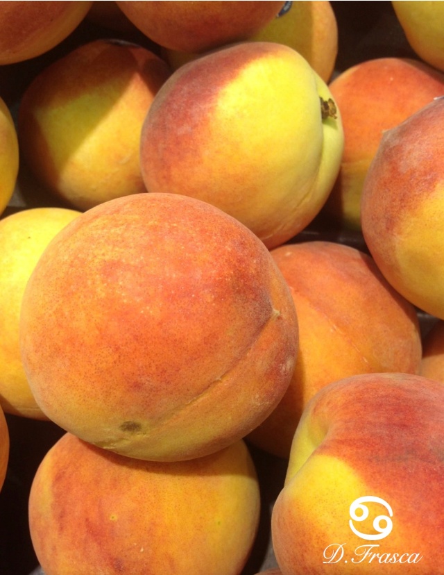
Why are people so afraid of the color peach? As soon as I mention peach in a color consultation I get the face you know, the one that looks like you just bit into a lemon? How did such a pretty, innocent color become so hated?
I think we have the 80's to blame on this one my friends. It's the dreaded sea-foam and peach color combination that soiled our minds forever. I happen to love sea-foam and peach and chose that color combo for my bedroom back in the day and yes, it was the 80's.
When clients love the spicy orange hues of Fall but don't want to go that dark they ask to “lighten it up a bit’. Well when you look at the paint decks we have to work with, lightening up this spicy hue turns into a peach or putrid pinky fleshy color which is not attractive. You have to go spicy all the way or choose a different hue if you don't like it.
There are very, very few “nice” peach paint colors out there that I use. Valspar has one called Mark Twain House Peach that I've used on several occasions but it's still not a big sale.
Then there's Approaching Autumn from the Color Stories collection that I've used many times before but again, this paint collection has a limited audience at nearly $70 a gallon.
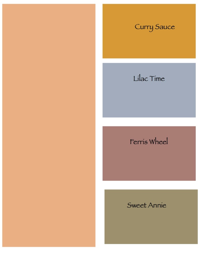
There are peaches that are pretty in just about all paint decks but certainly limited. For the most part, they are color choices for nurseries which I guess is approapriate. Wouldn't it be fun to use peach in a room but pair it with a totally unexpected color? This is what I do. Here are some color combinations from Olympic. It's a paint company that I don't use but I do like their colors.
I think if you take peach and use other colors that haven't been seen with it we may be able to start liking this hue again. What do you think?


No comments:
Post a Comment